H&M PLANNING
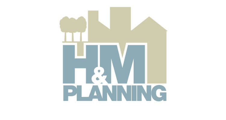
H&M Planning were a new company looking for a contemporary logo to lead the rest of their future branding. Neutral colours were chosen, to show consideration when addressing planning constraints.
The idea of intersecting the lettering with the logo imagery was again, to promote careful thought and planning – how buildings can fit together.
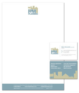
We went on to design and print a full stationery set. We printed the business cards on our most popular stock – 400gsm Matt Laminated, which really blow digitally printed cards out of the water! The letterheads were printed on a textured smoothwove stock, which, again reinforced their soft colours and non-harsh branding.